
“A Minsky moment is a sudden major collapse of asset values, which is part of the credit cycle or business cycle.
Such moments occur because long periods of prosperity and increasing value of investments lead to increasing speculation using borrowed money.”
China Growth Lower, But Debt Much Higher
Global debt has reached a record high, and three countries account for more than half of it, according to an International Monetary Fund (IMF) report released Wednesday. The number reached $164 trillion in 2016. It’s even higher today, as we’ll see in a few charts below but, hey, what’s an extra trillion or two amongst friends?
Stress in S&P500 vol appears extreme: BAML
$164 trillion amounts to 225% debt-to-global GDP. As rates rise, borrowing costs rise and with less in the pocket left over to spend, the economy slows. Credible academic studies show the stresses to an economy start at around 90% debt-to-GDP. The IMF said, “The global economy is more deeply indebted than before the financial crisis and countries need to take immediate action to improve their finances before the next downturn.” That’s not going to happen in my view.
But what does this all mean in plain English. How do you explain this to your client? I’ll take a shot at answering that question today by looking at the teachings of the great Hyman Minsky.
Too much debt is a drag on your personal economy. Think of it this way, if your brother earned $100,000 a year and had little debt, his financial stability would be great. If he had a mortgage with payments of $50,000 per year and $30,000 in outstanding credit card debt, costing him $30,000 per year, after taxes, his financial situation would be unstable. On his way from “great” to “unstable,” he had his job income to spend and was able to borrow and buy more things. Think about how his spending helped the economy. Many people did the same. Income plus credit equals more cash to spend until you reach a point that it’s hard to cover your monthly number and you can no longer borrow. And his problem grows worse should interest rates rise unless he can get his income up… but can you see how he’s squeezed.
After reading the IMF report, I came across a well-written piece by Jesse Felder about Hyman Minsky’s Financial Instability Hypothesis. Jesse writes:
Odey Doubles Down, Says We Are About To Witness A Massive Inflationary Shock
After remaining relatively unknown during the course of his lifetime, Minsky really came to fame in the immediate aftermath of the financial crisis as his hypothesis helped to explain what left most economists baffled: the fundamental cause of the crisis. Clearly, though, he has been forgotten just as quickly because, considering where we stand today, it’s obvious the economists with the greatest power to prevent another crisis have still not adopted his insights into their frameworks.
To begin to understand the current situation in Minsky terms we must first understand the hypothesis: The first theorem of the financial instability hypothesis is that the economy has financing regimes under which it is stable, and financing regimes in which it is unstable. The second theorem of the financial instability hypothesis is that over periods of prolonged prosperity, the economy transits from financial relations that make for a stable system to financial relations that make for an unstable system. In particular, over a protracted period of good times, capitalist economies tend to move from a financial structure dominated by hedge finance units to a structure in which there is large weight to units engaged in speculative and Ponzi finance.
Next we need to understand what these financing units are: Hedge financing units are those which can fulfill all of their contractual payment obligations by their cash flows… Speculative finance units are units that can meet their payment commitments on “income account” on their liabilities, even as they cannot repay the principle out of income cash flows… For Ponzi units, the cash flows from operations are not sufficient to fulfill either the repayment of principle or the interest due on outstanding debts by their cash flows from operations.
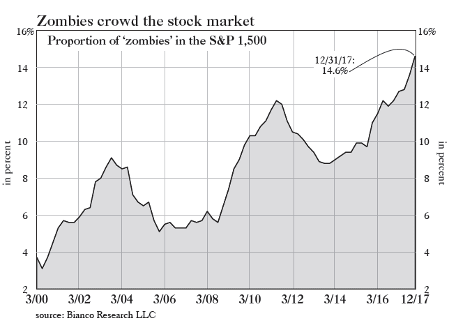
And this is what reminded me of Minsky when I read the recent article in Grant’s (Interest Rate Observer) with the accompanying chart below. It shows the percent of companies in the S&P 500 that would fall into Minsky’s “Ponzi unit” category. Specifically, Bianco Research defines these “zombies” as companies whose interest expense is greater than their 3-year average EBIT (earnings before interest and taxes). Currently, we face the greatest percentage of “Ponzi units” in at least 20 years.

For First Time Since 2000, Australian Govt Bond Yield Below UST As US Govt Reaches $21T Debt Mark
This should be worrisome to investors and even more so to those managing monetary policy because it suggests that financial instability within the economy may be greater than any other time over the past couple of decades. Minsky again: It can be shown that if hedge financing dominates, then the economy may well be an equilibrium seeking and containing system. In contrast, the greater the weight of speculative and Ponzi finance, the greater the likelihood that the economy is a deviation amplifying system.
Those last three words are critical. “A deviation amplifying system,” simply means an economy built on a virtuous cycle that risks evolving into a vicious one. So long as interest rates remain low and investor risk appetites remain strong, zombies will thrive and the economy will, as well, relatively speaking, of course. However, should interest rates rise and risk appetites reverse course, the risk of a self-reinforcing downturn grows. (Emphasis mine)
Minsky explains: In particular… if an economy with a sizeable body of speculative financial units is in an inflationary state, and the authorities attempt to exorcise inflation by monetary constraint [SB here – raising interest rates], then speculative units will become Ponzi units and the net worth of previously Ponzi units will quickly evaporate [SB here — i.e., your brother is toast]. Consequently, units with cash flow shortfalls will be forced to try to make position by selling out position. This is likely to lead to a collapse of asset values.
Interest rates have been rising for nearly two years now and the Fed seems to have turned its attention from cultivating a wealth effect in the economy by supporting asset prices via quantitative easing to reining in inflation by unwinding those policies and raising the Fed Funds rate. In the process, by way of the Minsky Hypothesis, they may end up undoing everything they strived so hard to achieve over the better part of the past decade.
It’s not hard to imagine just how vulnerable these zombies might be to rising interest rates and waning risk appetites. Should they be forced into liquidation a resulting collapse in asset values could present a major problem for the economy as there are plenty of reasons to believe the wealth effect may be even more powerful to the downside than it was to the upside. Either way, the threat to the economy posed by the greatest corporate zombie army in history is surely enough to make Minsky roll over in his grave.”
Our friends at Greenrock Research put it this way in their excellent second quarter 2018 investor letter, “The Fed has stated their policy. They plan to have three more rate hikes for the remainder of this year and three or four next year. In addition, they will reduce their portfolio of fixed income securities. The Fed did all of this in 1937. The Fed then lowered rates in 1929 in reaction to the depression just as they did in response to the recession of 2008. By 1936 the Fed thought our economy was stable and raised rates in 1937. Luckily for us, our current Fed can look at the mistakes made in 1937 when the stock market fell by 37%. They will need to be very careful; lowering rates creates an immediate solution for the economy, while raising rates is like playing with fire. So, it appears rates are going up, and that is generally not good for our economy.”
China – Deleveraging Up, Property Down, Liquidity Contracting
I believe the Fed will lead us once again into the next recession. Raising interest rates and selling bonds in a highly indebted “unstable” situation will result in recession. Zombie companies will default. What a great investment opportunity it will create. My best guess on timing: #2019Recession. Data dependent as they say… Keep the “inflation” and “recession watch” charts you’ll find when you click through below on your radar.
Grab a coffee and find your favorite chair. Thanks for reading… Have a great weekend!
♦ If you are not signed up to receive my weekly On My Radar e-newsletter, you can subscribe here. ♦
Included in this week’s On My Radar:
- Additional Notes on Debt (Several Charts)
- Inflation and Recession Watch Indicators
- Trade Signals — Market Tumult Pauses; Some Signals Remain Bullish
- Personal Note — West Palm Beach
Additional Notes on Debt (Several Charts)
While the IMF put the debt at $164 trillion at the end of 2016, another organization, the Institute of International Finance, clocked the number to be $237 trillion as of September 30, 2017. We know that the U.S. is running an annual account deficit of nearly $1 trillion and U.S. outstanding debt has gone from $20 trillion to nearly $22 trillion in a little more than a year. So, in a word… yuck.
$237 trillion in global debt puts global debt-to-GDP at 318%. Remember, 90% is the kind of line in the sand. Said Bloomberg, “The debt pile could end up acting as a brake on central banks trying to raise interest rates, given worries about the debt servicing capacity of highly indebted firms and government.” Source
Following are a few charts from the IMF report:
The world’s public and private sectors are more in debt now than at the peak of the 2008 financial crisis, when global debt/GDP peaked at 213%:

Some more details from the IMF: while advanced economies are responsible for most global debt, in the last 10 years, emerging market economies have been responsible for most of the increase. In fact, as we showed several months ago, China alone contributed 43% to the increase in total global debt since 2007.
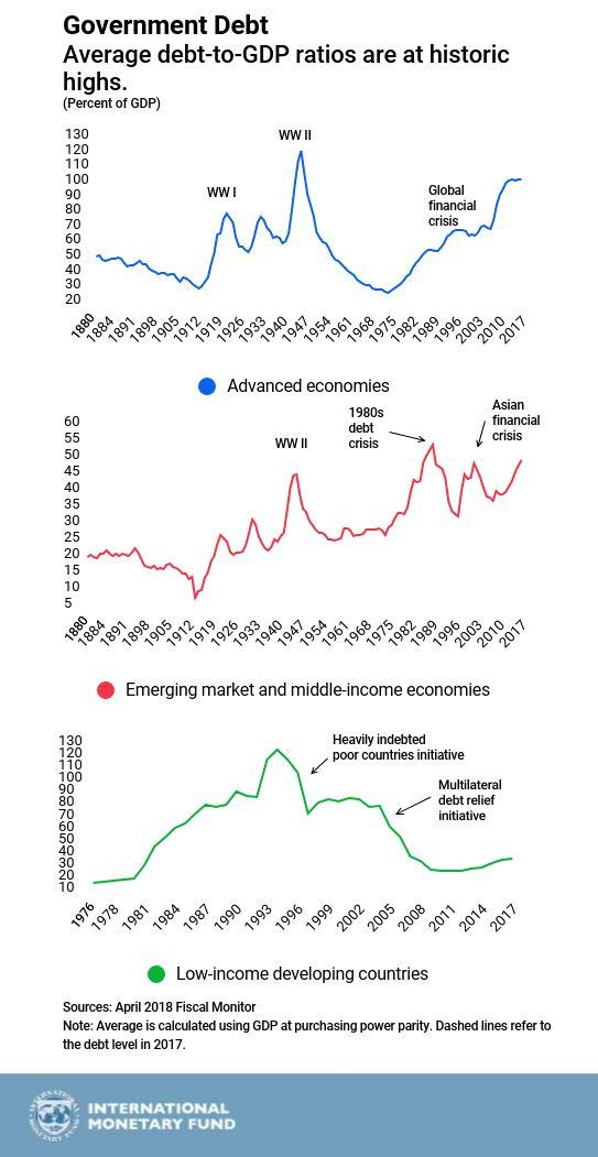
The following is from Zerohedge, “When looking at the big picture, needless to say it’s all about the US, China and Japan: these three countries alone accounted for half of the $164tr total in global public and private sector debt. And speaking again of China, its debt surged from $1.7 trillion in 2001 to $25.5 trillion in 2016, and was described by the IMF as the “driving force” behind the increase in global debts, accounting for three-quarters of the rise in private sector debt in the past decade.”
Here we should note that the IMF’s definition of debt is clearly different from that of the Institute of International Finance (IIF), which last week calculated that global debt had hit $237 trillion in debt or 318% debt/GDP.
Jeff Gundlach: Inflation, Debt And Warning – In Depth
Whatever the differences in debt calculating methodology, both agencies can agree on one thing: debt has never been greater and it once again poses an existential threat to the so-called “coordinated recovery”, which of course, only exists thanks to said surge in global debt.” Source: ZeroHedge
The IMF again recommended that countries raise taxes and lower public spending to decrease annual borrowing and get the burden of debt on a firmly downward path now that there is no need for fiscal stimulus. It’s NOT going to happen absent a crisis.
If the system weren’t so highly leveraged, high valuations and aged bull cycles would not bother me. Minsky has it right in my view:
- The economy has financing regimes under which it is stable, and financing regimes in which it is unstable.
- The second theorem of the financial instability hypothesis is that over periods of prolonged prosperity, the economy transitions from financial relations that make for a stable system to financial relations that make for an unstable system.
What I haven’t mentioned are the hundreds of trillions in derivative structures impacted by rising rates. It’s leverage on steroids. The financing of many of those derivatives are tied to Libor. I tweeted this out last week. Note how much it has risen (and keep the idea of three to six more Fed rate hikes in the back of your mind):
I also tweeted earlier last week (it shows that the Net Interest Expense to U.S. government will be higher than Defense and Non-Discretionary spending by 2025):
Follow me on Twitter @SBlumenthalCMG
You thought it might be my brother that borrowed too much and I thought it might be yours. Turns out it is “Big Brother” who’s deep in debt. It may be why gold is nearing a break out…
We sit squarely in an overleveraged and unstable regime. Rates are rising. Risk is high…
Let’s next look at the inflation and recession watch charts.
Inflation and Recession Watch Indicators
Last week, I promised I’d share with you my favorite charts. They follow below.
Inflation watch:
Monitoring inflation can be critical since turning points in inflation often determine turning points in the financial markets. The NDR Inflation Timing Model consists of 22 indicators that primarily measure the various rates of change of such indicators as commodity prices, consumer prices, producer prices and industrial production. The model totals all the indicator readings and provides a score ranging from +22 (strong inflationary pressures) to -22 (strong disinflationary pressures). Here’s how to read the chart:
- High inflationary pressures are signaled when the model rises to +6 or above. Low inflationary pressures are indicated when the model falls to zero or less.
- Note the red line in the bottom section of the chart. It shows we are currently in the high inflationary zone.
- I believe this keeps the Fed on its current path of raising rates… (Each week in Trade Signals I note if we are seeing “High” “Moderate” or “Low” inflationary pressures. The signal comes from this data set.)
My favorite Recession Watch Charts follow.
Chart 1: Inverted Yield Curve
This market indicator has predicted the past seven recessions going back to the late 1960s. An inverted yield curve occurs when short-term interest rates yield more than longer-term rates.
The last two times the yield curve inverted was in the years 2000 and 2006 before each of the last recessions. This next chart shows the yield curve tightening. Meaning for example, the interest rate difference between the 2-year Treasury and the 10-year Treasury (in Wall Street lingo, it is known as the “spread”):
Here’s how to read the chart:
- Simply note the two red circles.
- The top circle shows you where the current yield is on the 30-, 10-, 5- and 2-year Treasurys. Note the narrowing since 2014. Usually you get paid a much higher yield to own a 30-year bond vs. a 2-year.
- The bottom circle shows the narrowing of the yield difference between the 2-year and 10-year Treasury. It is currently at the lowest since it last inverted in 2006.
- The trouble does not start until we see the yield curve invert and the 10-2 spread turn negative. Current reading is a positive 0.45%.
- Bottom line: not yet inverted… no recession signal.
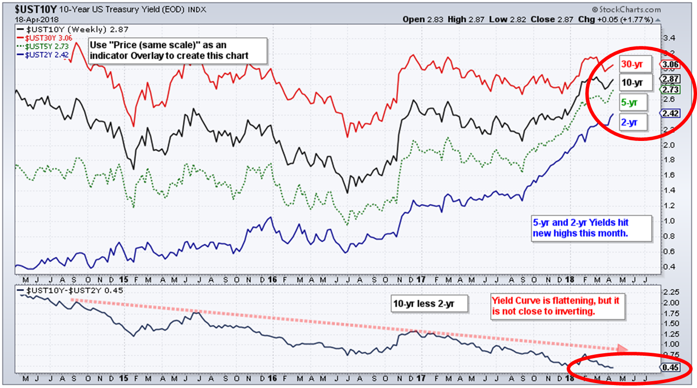
Chart 2: Recession Watch (Economy vs. Stock Market)
Here is how you read the chart:
- Signals are generated based on the S&P 500 relative to its five-month smoothed moving average (bottom section of chart)
- When the current price rises above the trend line by 3.6%, it signals an expansionary economy.
- When the price falls by 4.8% below the trend line it signals contraction.
- Arrows show the signals since 1948. Grey lines the recessions.
- Note the correct Signals of 79% (not perfect but pretty good).
- Bottom line: no current sign of recession.
Chart 3: Recession Watch (Based on State Conditions)
Here is how you read the chart:
- When the blue line rises above the middle dotted “recession” line, a recession is likely.
- When below it, a recession is unlikely.
- Data 1979 to present. Bottom line: No sign of recession.
Chart 4: Recession Watch (Escape Velocity vs. Recession Watch)
What you are looking at is a summary of 10 different recession watch indicators. Some of the signals have a higher success rate than others, but what I like is how they combined the indicators and created a weight of evidence summary.
Here is how to read the chart:
- Mostly all green is good.
- Compare :Current Level” to “Key Recession Level”
- Bottom line: No current sign of recession in next six to nine months.
Why keep such a close eye on recessions? In recessions the bad stuff happens. Excesses in the system get corrected, defaults spike and the stock market declines approximately -37% on average. The last two recessions served up losses of more than 50%.
Trade Signals — Market Tumult Pauses; Some Signals Remain Bullish
S&P 500 Index — 2,710 (04-18-2018)
Notable this week:
The Ned Davis Research CMG U.S. Large Cap Long/Flat Index remains at an 80% large-cap exposure signal, down from 100%. The 13-week trend line vs. the 34-week trend line remains on a “buy” signal. Volume Demand continues to be greater than volume supply, which supports a bullish posture. The CMG Managed High Yield Bond Program currently remains in a “buy” signal. Extreme investor pessimism is short-term bullish for the market as well, as you’ll see in the charts below.
On the economic calendar, jobless claims and the Philadelphia Fed Business Outlook Survey will be released tomorrow (April 19) at 8:30 am (ET).
The next section walks you through all of the Trade Signals charts.
Long-time readers know that I am a big fan of Ned Davis Research. I’ve been a client for years and value their service. If you’re interested in learning more about NDR, please call John P. Kornack Jr., Institutional Sales Manager, at 617-279-4876. John’s email address is jkornack@ndr.com. I am not compensated in any way by NDR. I’m just a fan of their work.
Click HERE for the latest Trade Signals.
Important note: Not a recommendation for you to buy or sell any security. For information purposes only. Please talk with your advisor about needs, goals, time horizon and risk tolerances.
Personal Note — West Palm Beach
I’m in Florida and about ready to send the letter to my edit team. The weather in Florida is fantastic… sunny and mid-80s. A nice break from the chilly northeast. Yesterday, I played at the Trump International Golf Club in West Palm Beach and this afternoon I’m playing McArthur in Hobe Sound. Business and pleasure but this afternoon is mostly pleasure. Years ago I played McArthur with my brother-in-law. An exciting afternoon is ahead.
I’m not sure about you, but I loved Barbara Bush. She was the definition of strength and grace. I came across a quote of hers this week and share it in honor of her passing.
But whatever the era, whatever the times, one thing will never change: Fathers and mothers, if you have children — they must come first. You must read to your children, hug your children, and you must love your children. Your success as a family, our success as a society, depends not on what happens in the White House, but on what happens inside your house.
Wishing you the best!
♦ If you are not signed up to receive my weekly On My Radar e-newsletter, you can subscribe here. ♦
With kind regards,
Steve
Stephen B. Blumenthal
Executive Chairman & CIO
CMG Capital Management Group, Inc.

