
Like the pine trees linin’ the windin’ road
I’ve got a name, I’ve got a name
Like the singin’ bird and the croakin’ toad
I’ve got a name, I’ve got a name
And I carry it with me like my daddy did
But I’m living the dream that he kept hid
Movin’ me down the highway, rollin’ me down the highway
Movin’ ahead so life won’t pass me by
Like the north wind whistlin’ down the sky
I’ve got a song, I’ve got a song
Like the whippoorwill and the baby’s cry
I’ve got a song, I’ve got a song
And I carry it with me and I sing it loud
If it gets me nowhere, I’ll go there proud
– Jim Croce, “I Got a Name”
Q2 hedge fund letters, conference, scoops etc
It was a long day. A good day. It ended great. “In the sweet summer time… sweet summer time, summer time.” “She was a black-haired beauty with big dark eyes.” Kieran controlled the playlist. Susan was seated next to me with bottles of wine in hand. Music loud. Clear night. Feeling happy. The kids think the music is their’s. We think it’s ours.
It began with Bob Seger & The Silver Bullet Band’s “Night Moves.” The hits continued:
The Rolling Stones, “Sympathy for the Devil”
Elton John, “Levon”
Bob Seger & The Silver Bullet Band, “Against the Wind”
Crosby Stills Nash & Young, “Old Man”
The Hollies, “Long Cool Woman”
Jim Croce, “I Got a Name”
Bruce Springsteen, “Streets of Philadelphia”
John Denver, “Annie’s Song”
The Kinks, “Lola”
Kansas, “Dust in the Wind”
Harry Styles, “Sign of the Times”
Leon Bridges, “River”
Bruce Springsteen, “Drive All Night” (I really love this one.)
John Denver, “Leaving on a Jet Plane”
Aretha Franklin, “(You Make Me Feel Like) A Natural Woman”
Procol Harum – “A Whiter Shade of Pale”
Louis Armstrong – “What a Wonderful World”
And finally, new to my ears, Susan queued up “Giant” by Calvin Harris and Rag’n’Bone Man. Raspy voice… it will lift you up.
I am a giant (Ooh)
Stand up on my shoulders, tell me what you see
‘Cause I am a giant (Ooh)
We’ll be breaking boulders, underneath our feet
I am, I am, I am, I am, I am, I am a giant (Oh)
I am, I am, I am, I am, I am, I am a giant (Oh)
Don’t hide your emotions
You can throw down your guard
And free from the notion
We can be who we are
Put that one on your pre-game, pump-up list. Over the weekend I’ll compile a Spotify playlist and share the link with you. Best played loud with fine red wine in hand (or your favorite beverage) sitting with those you love most.
Now with that fun out of the way, let’s take it up a notch. There is nothing quite as exciting as reviewing the latest equity market valuations. “Right, Steve,” you say. I hang my head and sigh. But it is important to keep on your radar so this week, let’s go fast and race through with charts (arrows and short commentary when you click through below). It’s been many months since our last look. Same story, but always good to reset footing. Bottom line: The stock market remains expensively priced, more adult beverages may be required.
So grab that coffee and find your favorite chair. When you click through on the orange On My Radar button you’ll also find short commentary on the Fed’s first interest rate cut since 2008 and what it might mean and the most recent Trade Signals (the equity, fixed income and gold trends remain positive). Thanks for reading.
If a friend forwarded this email to you and you’d like to be on the weekly list, you can sign up to receive my free On My Radar letter here.
Follow me on Twitter @SBlumenthalCMG
Included in this week’s On My Radar:
- Valuations
- The Fed
- Trade Signals – Fed Day: “Cycle Peak Follows Fed Funds Peak”
- Personal Note – Shakespeare in the Park & Fishing in Maine
Valuations
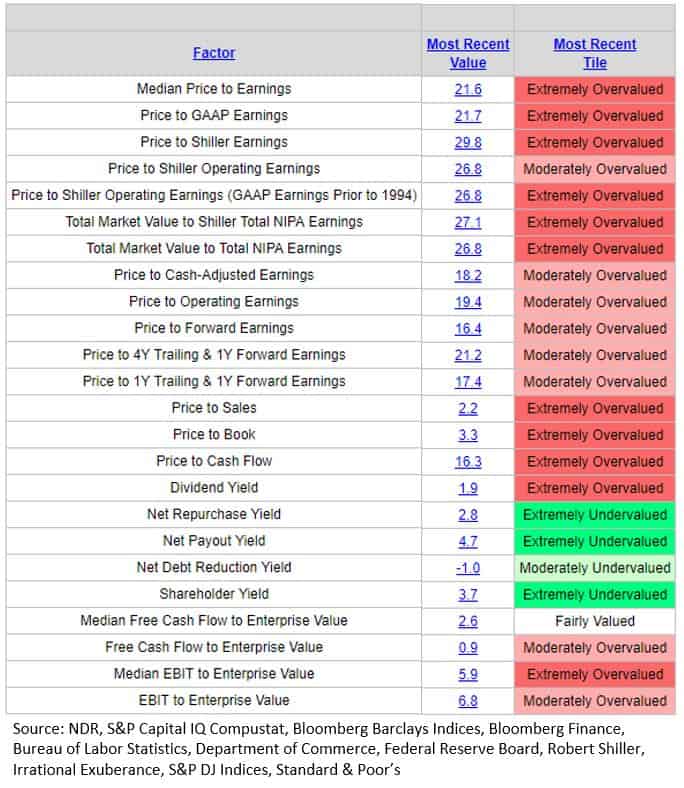
First, the big picture. Following is a dashboard of several important valuation metrics. Red is bad, green is good. As you can see, most are moderately to extremely overvalued.
Chart 1: Valuation Dashboard
Let’s next dig a bit deeper. The idea here is to get a feel for what valuations tell us about coming returns, as well as degrees of risk (high risk when extremely overvalued with probability of low 3-, 5- and 10-year returns.
Chart 2: Median P/E
Here is how to read the chart:
- Middle section (red line) plots Median P/E of the S&P 500 Index over time.
- The red “We are Here” arrow points to 7-31-2019 Median P/E. NDR says it is in the extremely overvalued zone (see dashboard above).
- Since 1964 (55.4 years), the “mean” Median P/E is 16.7. NDR calls that “Mean Fair Value.”
- To get some basic footing: The “mean” is the “average” you’re used to, where you add up all the numbers and then divide by the number of inputs. The “median” is the “middle” value in the list of numbers.
- Standard deviation is a number calculated to indicate the extent of deviation for a group as a whole. One standard deviation moves (the first line above the green line in the chart below) have happened before and this chart shows you how often that has occurred through history. Two SD moves are less frequent. Both on the upside and on the downside. Note the bargains achieved in the early 1980s, early 1990s and again in 2008/09.
- Lastly, what I like best about this chart is how it shapes risk and opportunity. The bottom red arrow points to the level in the S&P 500 where you may want to get more aggressive with your equity exposure.
- Bottom line: The market can most certainly go higher but valuations are high, risk is high (the economy is late cycle, the bull market is late cycle).
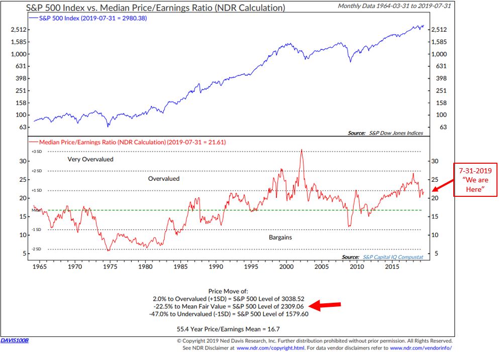
Chart 3: Normal P/E
Here is how to read the chart:
- Normal P/E is a valuation line (middle section red line) created by combining six different valuation metrics: Dividends, Earnings, Cash Flow, Sales, CPI-adjusted P/E and Trend.
- Focus in on the two “We are Here” arrows. Top one shows how high we sit relative to other points in time dating back to 1926.
- The bottom arrow shows what the returns were the subsequent half year, 1, 2, 3, 4 and 5 years.
- Bottom line: Returns gained if one’s starting place had been in the “overvalued zone” (such as today), were low. Shown are the gains years later. For example, the total gain five years later was 11.60% (an annualized return of about 2% per year). 10 years later the gain was 40.55% (an annualized gain of approximately 3.25% per year).

Chart 4: P/E Based on Forward Earnings (Normalized)
Many people, especially Wall Street sell-side firms, talk about Forward P/E. This is based on what firms are estimating coming earnings to be. For example, the great Leon Cooperman was on CNBC yesterday sharing his thoughts on the market. He noted forward P/Es and said he doesn’t believe the market is overvalued though he said he is not adding new stocks because the market is advanced. I disagree with him on valuations. And I don’t like the P/E based on future earnings estimates because too often the earnings are revised lower. In any event, even by this measurement, the market is richly priced.
Here’s what to focus in on:
- Green line – lower section of chart.
- Data box bottom right: It plots the subsequent returns of the S&P 500 Index based on actual data back to 1927.
- Bottom line: Even this favored measure is high at 22.7. Probable coming returns are 0.73% (shaded area box – bottom right).

Chart 5: Median Price-to-Sales Ratio
Bottom line – same conclusion (zero in on the red “We are Here” arrow).

Let’s next look at several different valuation measurements.
Chart 6: Total Market Value vs. Money Market Fund Assets
The logic is simple, when there is a greater percentage of money in money market funds, there is greater ammo to be used to buy stocks. More buyers than sellers drives prices higher. True for oil, bananas and everything else. When we run out of buying power, returns slow. Of course, you could argue that corporations may step in to buy stocks (and they have) but they too reach a point when they’ve borrowed too much and run out of fire power (I believe that is now the case).
But let’s just focus in on a comparison of the total value of the stock market vs. money market funds.
Here’s how to read the chart:
- Focus in on the red line in the lower section of the chart. It plots Money Market Fund Assets to NDR Total Market Value (The upper section of the chart shows you the Total Market Value (NDR calculation) is $31.1 trillion. The second section shows Money Market Fund Assets.
- Key is the ratio of available money market funds to the total value of the stock market.
- The data box on the bottom right plots the return of the stock market simply based on the ratio of MM funds. Bottom line: The shaded area shows us the current regime. Expect low returns.
- Note the ratio in 2008-09. It peaked at 46.91%. Fear was extreme. Everyone raced out of stocks. You want to be a buyer when everyone is selling and a seller when everyone is buying. I wrote a piece back then tiled “So Bad It’s Good” and recommended it was time to buy. I was very scared. I bought.

Chart 7: Percent of Stock Market Capitalization as a Percentage of Gross Domestic Income
The idea here is that if the market gets really pricey compared to gross domestic income (how much we collectively earn) it can tell us if the stock market is overvalued or undervalued relative to the economy. Data back to 1925.
Here is how to read the chart:
- The lines in the lower section identify the levels (Bottom and Top Quintiles) at which the market is undervalued or overvalued.
- The table at the upper left shows the average returns years later.
- Bottom line: Zero in on the upper left-hand arrow for the market gains years later based on the ratio. Mostly negative. Further, major market peaks have occurred with the ratio in the overvalued zone, major market bottoms have been seen with the ratio in the undervalued zone. We sit in the upper zone. (“We are Here” arrow.)

Chart 8: Forward Returns Based on Shiller P/E

I recently shared data around stock market performance and recessions in OMR here. Investing is a marathon and not a race. Knowing your initial starting conditions can help you know when to overweight and underweight different types of investments.
A few weeks ago I shared a different version of the above chart along with thoughts around What Might the Endgame Look Like. The piece was titled, On My Radar: Mauldin Strategic Investment Conference Wrap-Up. It was nice to find Ray Dalio coming to a similar conclusion. I’ll be stress testing my views with my friends next weekend at Camp Kotok. Stay tuned.
The Fed
The Fed lowered interest rates a quarter point this week from 2.50% to 2.25%. The last time they cut rates was in 2008. Recession typically follows. The thinking is that data is delayed and the Fed is typically slow to respond. Essentially, the economy is heading into recession. Since Wednesday, the market is lower. Trump’s unhappy. Others too. The dollar has rallied and that’s not good given the debt complexities today. Others are unhappy with Trump’s trade war. He’s turned the screws on China trade another 10%. Ask the retail industry what they think. Yet just a few days do not a trend make.
If you’ve been reading me for some time you know I believe we are heading back to the zero bound. My big concern is the massive size of debt here, there and everywhere. The Fed is pushing on a string and will be until some greater intervention addresses the problem both in the U.S. and globally. We’ve borrowed from the future to spend today and the future has arrived. I believe Congress will pass legislation to monetize the debt. Yes – poof… gone. That requires many fights and new laws. As for our elected officials, I see more them in them than “We the People” in them. So we need to tighten the screws… Going to get bumpy.
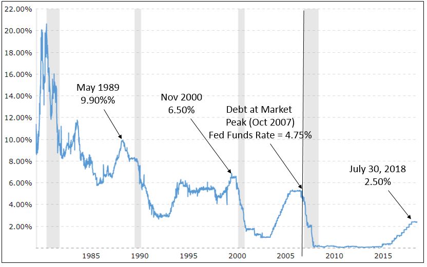
This next chart shows the Fed Funds Rate since the early 1980s. A couple things to zero in on:
- First, recession has followed rate cuts, though not all of them (though it is notable that recession has followed a yield curve inversion 100% of the time if the inversion lasted at least three months. That has now happened so “lights on.”
- Second, note that following the May 1989 cut, the Fed went on to drop rates all the way from 9.90% to 3%. That’s a lot of fire power in their tool kit to help the economy. In the next chart, I want you to note the level of debt then vs. now (set that aside for just a second).
- Third, note the points at which the Fed lowered rates the last several times. November 2000, from 6.50% to 1.50%. A 5% point drop was a big lever to pull. Next look at October 2007. The Fed Funds Rate was 4.75% and they dropped it to zero. Each time a drop of roughly 5% to get the economy moving again.
- Fourth, look at where the Fed started today. 2.50% does not leave them much room. This matters.
The next chart takes a look at Gross Federal Debt as a percent of GDP. The debt level as a percent of GDP in 2000 was approximately 100%. It was approximately 118% in 2007. It was 176.3% debt-to-GDP at the end of March 2019. Lift the debt ceiling, my friends. It’s going up and when recession comes, it worsens quickly.

Responding to the Fed’s press conference, my fishing friend, Sam Rines, said the following in his piece titled, “Blah, Blah, Blah…. I didn’t say just one.” Brilliant title by the way. Here is his summary of the FOMC July 31, 2019, press conference:
While the reaction function was laid out in convoluted manner, it was indeed laid out. This insurance easing cycle will probably be similar to the mid-1990s. This was the argument laid out in January.
Communication is hard, but Powell made it look impossible. It is not difficult to say “We are easing policy in a similar way to what has been done in the past” which implies 1 – 2 more cuts. Anyway, the data to watch for the new reaction function are global economic uncertainty and growth (PMIs and CAIs), and any deterioration in the consumer. The natural rate and inflation are important parts but are generally slow moving phenomenon’s, and therefore will not be the data points moving markets.
Is this “as bad as it gets” for Fed communication? While it is impossible to know, one can only hope. If no one has set up a Go Fund Me page to buy Powell media lessons, it might not be a bad idea.
Here are three expert takes that reached my inbox last night and this morning from Brian Wesbury, Bill Dunkelberg and Mark Grant.
Wesbury: The Fed still claims it is “data dependent” but no one should believe it. If the Fed wanted to cut rates, it should have gone further and cut 50 bps or more to signal this was one-and-done. Instead they incentivized everyone to postpone buying decisions and hope for even lower rates.
Dunkelberg: This rate cut will inflate the stock market, creating even more “wealth” that will buy less per dollar because output is growing slower than wealth (i.e., claims on that output). Dribbling out the cuts instead of one large one would have done far more to raise spending and maybe produce the higher inflation the Fed wants.
Grant: The U.S. is under financial assault by negative rate policies elsewhere and the Fed must cut rates to keep the dollar from strengthening too much. Lower rates will mean more stock buybacks, bond refinancing, lower mortgage rates, etc. but at the cost of leaving investors everywhere with almost no yield opportunities. This is negative for insurers, banks, pension funds, savers and retirees, all of whom will be forced into riskier assets.
So, download my “Gone Fishing” playlist (I’ll send it to you next week along with a few fishing photos), grab a few glasses of red wine and know that we are all going to be ok. My message is one of caution and it is one of coming opportunity, unless you get run over on the way to the opportunity. You’ll find the dashboard of trend indicators in Trade Signals (you’ll need to click on the link provided in the next section). Put a process in place that works for you, hire good people if you need assistance and stick to your game plan.
Trade Signals – Fed Day: “Cycle Peak Follows Fed Funds Peak”
July 31, 2019
S&P 500 Index — 3,016
Notable this week:
Given today is Fed Day, I thought the following chart appropriate. There are no significant changes in the Trade Signals since last week (dashboard above). We’ll take a look at the most recent valuations in Friday’s On My Radar.

Not a recommendation for you to buy or sell any security. For information purposes only. Please talk with your advisor about needs, goals, time horizon and risk tolerances.
Click here for this week’s Trade Signals.
Personal Note – Shakespeare in the Park & Fishing in Maine
I remember when I was Kieran’s age. In the summer of ’79, I’d drive from the middle of Pennsylvania to Philadelphia, Maryland, Virginia and New Jersey for soccer training/games. Long drives made easier listening to my favorite songs. Remember the in-dash cassette tape players. You could pause, stop, rewind and play your songs over and over again. A big step up from radio. Windows down, I’d play, rewind, play again… doing my best to memorize the songs. A new Spotify list will be created this weekend. I’m going to title it “Gone Fishing.” It will include the above songs and if you are a Spotify fan like me, I’ll share the list with you via Spotify.
I’m flying to Grand Lake Stream, Maine early next Thursday for the annual Camp Kotok fishing weekend. A gathering of economists, former senior Fed officials, investment managers, financial reporters – many names you know. We all agree to operate under the Chatham House Rule, which is a system for holding debates and discussion panels on controversial topics. Anyone who comes to the meeting is free to use information from the discussion, but is not allowed to reveal who made any comment. This creates a safe space designed to increase openness of discussion.
Much is going on with China. I’m looking forward to sharing a canoe, fishing and getting to know Jonathan D. T. Ward. He is author of China’s Vision of Victory. General David Petraeus, US Army (Retired), former Commander of coalition forces in Iraq and Afghanistan and US Central Command, and former Director of the CIA said, “Jonathan Ward has provided an eye-opening analysis of China’s strategic ambitions. He effectively demolishes the long-standing expectation in Washington that a prosperous rising China will be content to integrate itself into the Western international order – to the contrary, he demonstrates that Beijing’s objectives include nothing less than renovating that order to serve China’s own strategic interests. As the United States debates the future of its China policy, China’s Vision of Victory deserves the widest reading.”
Robert D. Kaplan, author of Monsoon: The Indian Ocean and the Future of American Power said, “I’ve long admired Jonathan’s determination to get to the truth, on the ground. It is rare to find someone able to combine politics, philosophy, linguistic expertise and hard travel – and bring it to bear on some of the toughest issues of our generation – Jonathan is one of those remarkable people.”
Ok – how about some time on a glass-like lake, fishing rod in hand with that guy. You can google his book and buy it on Amazon.
Next week’s letter may prove to be challenging. With little down time, OMR will be a maybe… I’ll play it by ear. Really looking forward to the trip to Maine and sharing with you what I learn – stay tuned.
Finally, I was in NYC this past Wednesday and Thursday. Good friend, Rory Riggs, takes his summer interns and team to see “Shakespeare in the Park.” My daughter, Brianna, works for Rory and son, Matthew, and stepson, Tyler, joined us. Pre-event was at a bar on the Upper West Side. Drinks, lobster rolls and friends. Great fun!
Wishing you the very best!
Best regards,
Stephen B. Blumenthal
Executive Chairman & CIO
CMG Capital Management Group, Inc.

