
[Trump tweets, Xi Jinping, Global debt, the ECB Greenspan Put and Powell QT, He won’t do the same damn thing]
Q3 hedge fund letters, conference, scoops etc
“We didn’t start the fire
It was always burning
Since the world’s been turning
We didn’t start the fire
No we didn’t light it
But we tried to fight it.”
“We Didn’t Start the Fire,” words and music by Billy Joel
I had fun writing last week’s piece. We didn’t start the fire, but we are all bit players within the machine. If you didn’t have a chance to read it, I shared Ray Dalio’s recent post on how economies and markets work. You can find it here. A roadmap of sorts of what is to come, what you can watch out for and how you might position to profit.
This week let’s take a look at the beginning of the year valuations, which are effectively our current starting conditions. You’ll see that equity market valuations have come down post the Q4 market swoon but they do remain elevated. A better “get aggressive” re-entry point remains in front of us.
My kids will be yelling, “We didn’t start the fire…” And when they come to understand the size of the problem, they will be very angry with us. But it will get solved. Dalio writes about the tools available to legislators and central bankers and how they can use them to soft land this end of a long-term debt accumulation cycle mess. It will be bumpy. Very bumpy so stay risk minded.
Grab that coffee and dig in. A quick read this week…
♦ If you are not signed up to receive my weekly On My Radar e-newsletter, you can subscribe here. ♦
Follow me on Twitter @SBlumenthalCMG
Included in this week’s On My Radar:
- 2019 Beginning Year Valuations
- What They Tell Us About Coming 10-Year Returns
- Trade Signals – More Sell Signals, Recession Risk Rising
- Personal Note – Coach, Vail and Florida
2019 Beginning Year Valuations
It is important to note that valuation metrics can tell us a great deal about coming 7-, 10- and 12-year equity market returns, but they tell us little about the timing of market corrections. I like to think in terms of risk/reward and probabilities. When valuations are high, we are not going to get as much (return) for our money. When they are low, we get much more (return) on our money. Also important to note is that the risk we take is highest when valuations are highest and lowest when valuations are lowest. Thus, they may help you better size the bets you take in your portfolio or portfolios if you are an advisor.
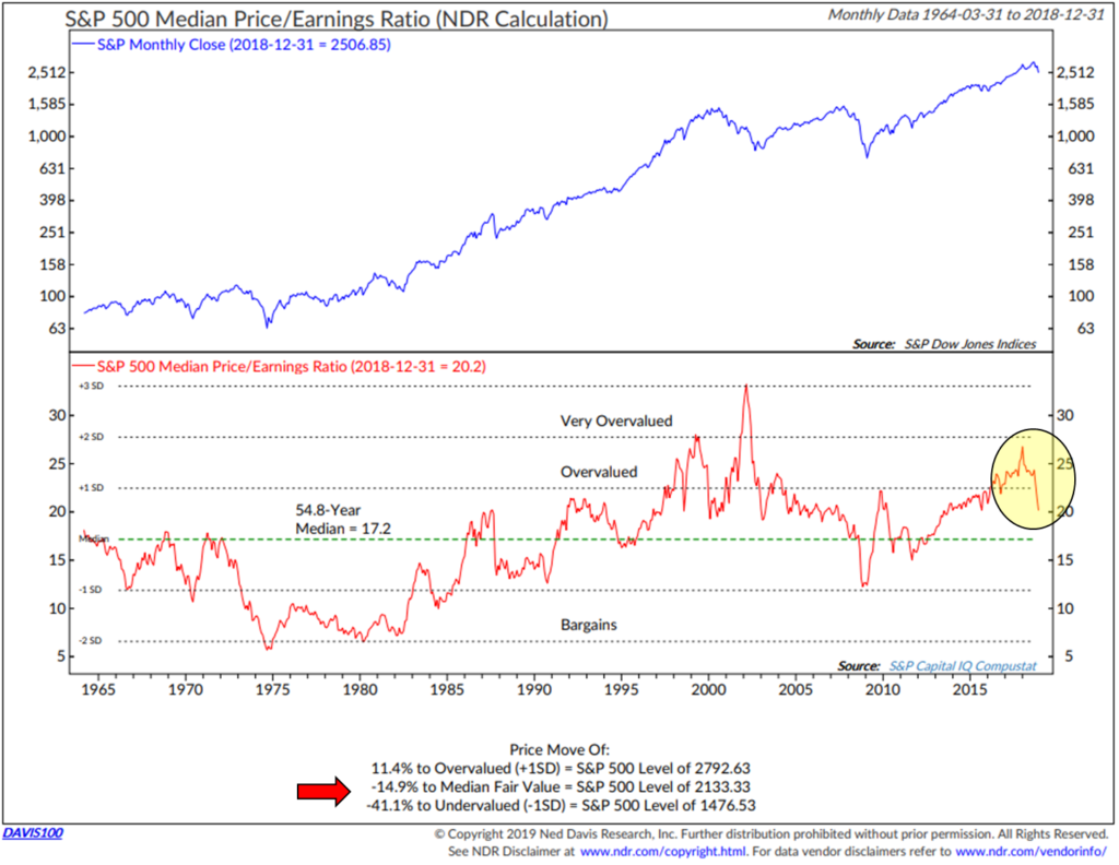
Median Price-to-Earnings (P/E)
Here is how to read the chart:
- The current Median P/E Ratio of the S&P 500 is 20.2 (12-31-18). It’s down from a high of nearly 29 at the start of 2018. Contributing to the decline were corporate share buy-backs, increased earnings and the fourth quarter stock market correction.
- The yellow circle highlights the drop.
- In terms of probable near-term returns, I like to look at the lower section of this chart. The red arrow points to how much farther the market would need to drop from the S&P 500 Index level of 2506.85 on December 31, 2018 to reach “Median Fair Value.”
- Median Fair Value is the 54.8-year Median P/E of 17.2. So a 14.9% decline in the market will get us to that level and puts the Median Fair Value of the S&P 500 at 2133.33. I believe it is possible we see that level or lower in the next recession. As long as the Fed has the market’s back, we likely continue to trade above Median Fair Value. The S&P 500 Index is currently at 2590 (1-11-19), so it will take a drop of another 3% on top of the -14.9% to get to Median Fair Value.
- Bargains would present at S&P 500 Index level 1476.53. That is approximately 44.1% below the current 2590 level of the S&P 500. Again, it’s possible that we will see that level or lower in the next recession.
- Bottom line: For the first time in several years, the market could gain 11.4% from the 12-31-18 close to reach overvalued. That too is probable. While valuations are better, the market remains overvalued. Risk remains elevated.
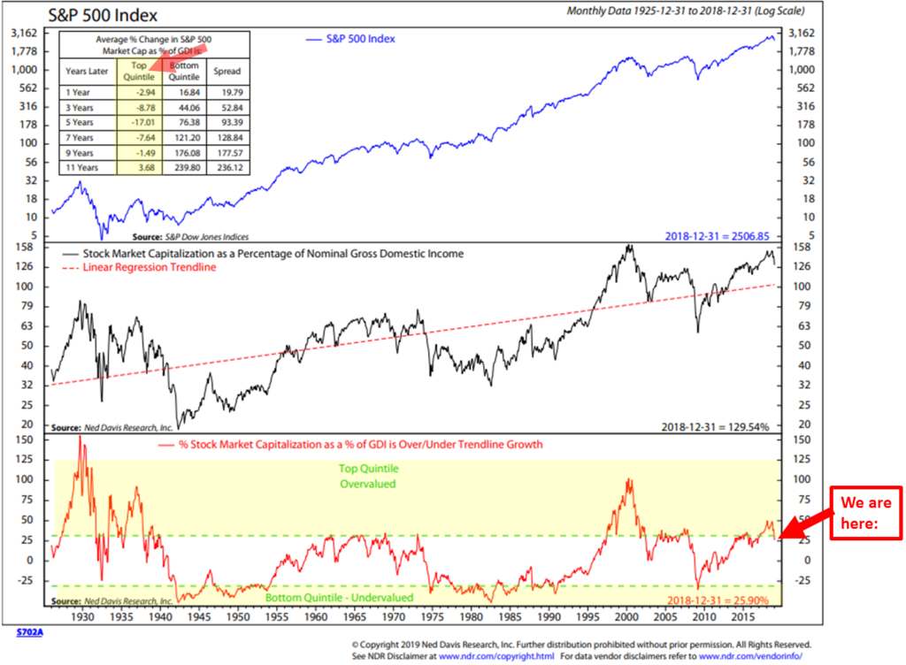
Stock Market as a Percentage of Nominal Domestic Income
Quick story: My mother-in-law is very smart and an expert investor. She admits to me that when she gets to the chart section in my posts she skips over them. You may feel the same. This next one had me doing a bit of a double take… as it took me a few minutes to figure out how to read it. But I do think the math is important, so I’m sharing it with you and I’m wondering what my beautiful mother-in-law will say? Put your quant hat on…
Here is how to read the chart:
- First, the charts plots the overall valuation of stock market based on the number of shares each company has outstanding times their share price. Then add all of the company’s valuations together to get the total valuation of the stock market. Then compare the total value of the stock market to the Nominal Gross Domestic Income and you get a ratio. Think of Nominal Gross Domestic Income as all of our incomes added up together. Over time, the market should not get too overvalued relative to how much income the U.S. (you and me and everyone) collectively makes.
- The bottom sections “We are here” arrow points to the current level. At year end, the Stock Market Cap was 129.54% vs. Nominal Gross Domestic Income. It’s been in the Top Quintile, which is the “Overvalued” zone and just moved slightly out of the overvalued zone. Other high valuations were 1929 to 1940, 1966 to 1974, 1997 to 2000, 2004 to 2008 and most recently.
- The bottom yellow highlight shows the most undervalued zone. That’s when the Market Cap to Nominal Gross Domestic Income is at about 73% or 27% lower than Nominal Gross Domestic Income.
- Now, to translate into risk/reward, take a look at the arrow and yellow highlight in the upper left hand section of the chart. When in the top quintile, market returns over the subsequent 1-, 3-, 5-, 7-, and 9-years are all negative and 11 years later is not so great. For example, if you look at the three-year number of -8.78%, that means your investment was down -8.78% after three years. Down -17.01% after 5-years. Up 3.68% after 11-years. Who do you know that has the patience to take that ride to nowhere? Not good.
- Now look at the annualized returns that followed 1, 3, 5, 7, 9 and 11 years when you bought in when the total Stock Market Cap was much lower than Nominal Gross Domestic Income (Bottom Quintile = “Undervalued” stock market). Up 44.06% after 3-years, +76.38% after 5-years and +239.8% after 11-years.
- Bottom line: The market is overvalued by this measure. Expect low returns over the coming 1, 3, 5, 7, 9 and 11 years. Seek different solutions that may improve your returns. Buying and holding cap-weighted low fee index funds works when your starting point is bottom quintile (2009 for example) and not when your starting point is the top quintile. You may get some good years, but history tells us that those returns tend to get washed away in subsequent years and end result is negative over 1-9 years and only slightly positive over 11 (if you are able to say on the ride that long).
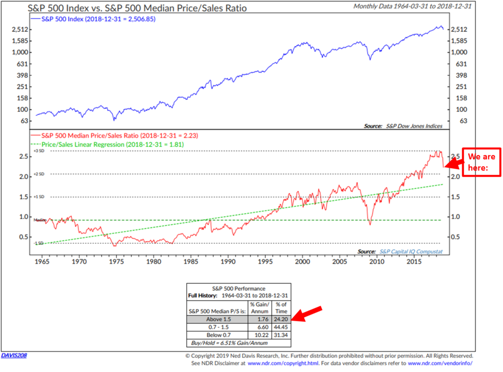
Median Price-to-Sales Ratio
Here is how to read the chart:
- Focus in on the “We are here” arrow. The recent correction has caused the Median Price-to-Sales Ratio to decline; however, it is still elevated.
- Note the bottom red arrow. It shows the annual gain per annum for the market when the ratio is above 1.50. The current number is 2.23.
- Bottom line: Same story. The market is overvalued by this popular measure.
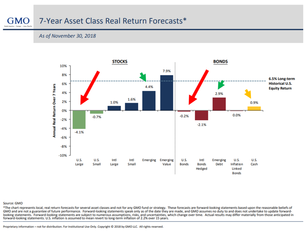
GMO’s 7-year Asset Class Real Return Forecasts
Buffett Indicator: Corporate Equities-to-GDP
Simple note the 151.0% equity valuation-to-GDP is the second highest valuation level since 1950. Bottom line: The market is richly priced/overvalued by this measure.
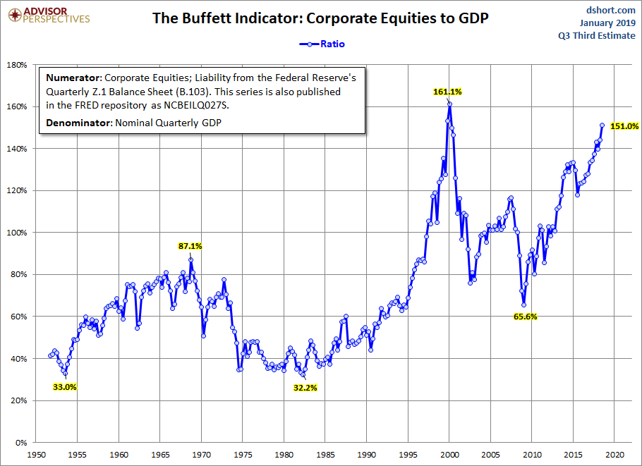
Highest if measured by the Wilshire 5000 Index to GDP
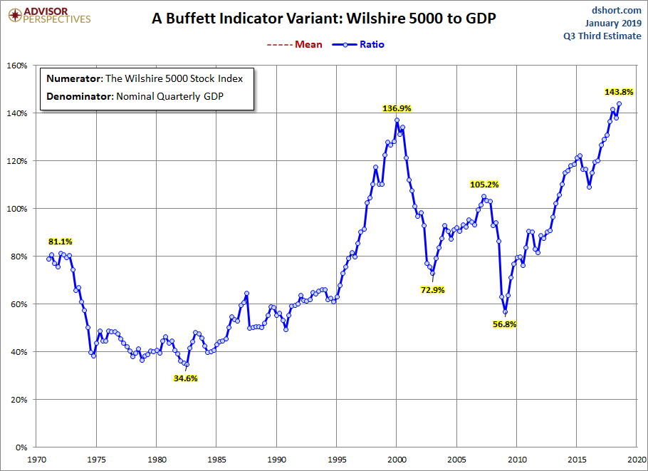
Source: Advisor Perspectives
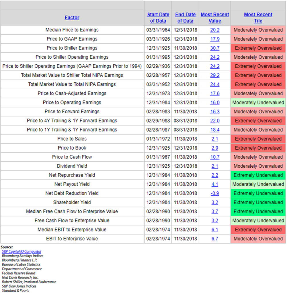
Dashboard of Valuation Indicators
There are a number of other market metrics that we can take a look at and most all come to the same conclusion. The market is either extremely overvalued or moderately overvalued by most measurements. In the next chart, see it like a dashboard of indicators (red is bad, green is good). I have no math on subsequent returns on the few indicators that are flashing green.
Bottom line: The recent sell-off has improved valuations conditions, but we are nowhere near a buying opportunity. I’ll continue to update you in On My Radar as the year progresses.
What They Tell Us About Coming 10-Year Returns
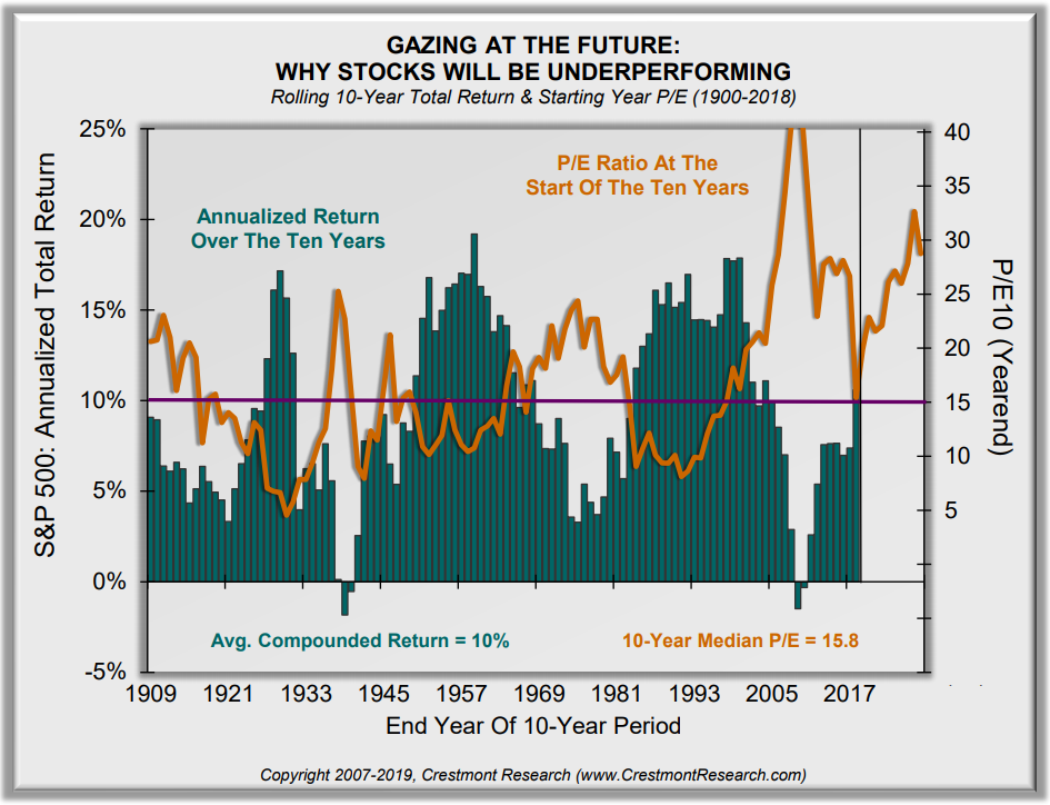
“The starting level of P/E is the most significant driver for subsequent returns. To see the power that P/E has to impact future returns, ten-year returns are offset in the chart to align subsequent returns with starting P/E…” according to Ed Easterling of Crestmont Research.
Important notes from Ed:
- The next chart demonstrates the impact of the starting level of P/E across more than a century of history. It forecasts the likely level of return over the next decade.
- Ten-year annualized returns decline significantly as the starting level of P/E rises. The ten-year period ending 2028 will likely have a very short bar in the chart.
- Annualized returns will be well below average.
- With awareness of the environment, investors and advisors can take appropriate action to achieve investment success despite market conditions.
Here is how to read this next chart:
- Orange line plots the beginning year P/E (P/E level shown on right side of chart).
- Green bars plot the actual 10-year annualized returns (% levels on left side of chart).
- Bottom line: high P/Es lead to low subsequent 10-year annualized returns. Current P/E remains elevated; expect low coming 10-year returns from equities.
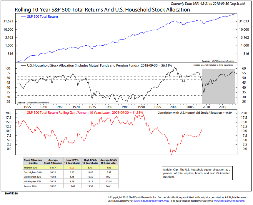
Rolling 10-Year S&P 500 Total Returns and U.S. Household Stock Allocation
One of my favorite coming 10-year return charts has nothing to do with valuations. It looks at how much U.S. households have allocated to stocks as a percentage of their total portfolio.
Here is how to read the chart:
- Middle section plots the percentage in stocks. Current number is 56.11% (latest available data as of 9-30-18). You can see that there were just a few times the reading is this high (look at 2007, 1999 and 1969).
- The lower section (red line) plots the return of the S&P 500 Index that was achieved 10 years later. For example, if the starting % in stocks was 52% in 1965, your annualized return achieved 10 years later was 0% per year.
- If the starting % allocated to stocks was 25% in 1982 (black line middle section), your subsequent annualized return achieved 10 years later was 17% per year (red line lower section).
- NDR then broke the % allocated to stocks (quarterly data) into five quintiles that ranged from lower % allocated to stocks to highest % allocated to stock. The yellow highlight at the bottom of the chart shows the current regime. It plots the “Lowest Gain Per Annum 10 Years Later,” the “Highest GPA 10 Years Later” and the “Average GPA 10 Years Later.”
- Bottom line: Expect low coming 10-year returns. Investors are “all in.” Best to get aggressive when they panic out.
One last point to make: Currently, the second longest secular bull market in history. The oldest on record, according to FINRA, was October 1987 to March 2000. It lasted 4,494 days, made 308 all-time highs and gained 582%. The current secular bull market has lasted approximately 3,566 days and has gained approximately 276%. Aged and overvalued. Risk is high.
Trade Signals – More Sell Signals, Recession Risk Rising
January 9, 2019
S&P 500 Index — 2,585
Notable this week:
The Ned Davis Research (NDR) CMG Large Cap Momentum Index has signaled a reduction in equity exposure to 40% from 80%. The balance of the equity market signals are in sells. The CMG Managed High Yield Bond Program moved to a buy signal earlier in the week. The Zweig Bond Model remains in a sell signal (suggesting short-duration high quality bond market exposure over high quality long-duration ETFs and mutual funds). Pessimism remains extremely elevated. We’ve experienced a strong rebound rally in stocks. The S&P 500 Index and DJIA are now testing overhead resistance. That may challenge further advance.
Also of note, one of the U.S. recession watch indicators signaled high recession risk since last week.
Click here for this week’s Trade Signals.
Important note: Not a recommendation for you to buy or sell any security. For information purposes only. Please talk with your advisor about needs, goals, time horizon and risk tolerances.
Personal Note – Coach, Vail and Florida
As I’m finishing today’s piece, Susan is in Chicago at the annual United Soccer Coaches Convention. As she was checking in this morning at the registration desk, there was a larger-than-life picture of my old soccer coach, the great Walter Bahr. I paused from writing and smiled with a tear in my eye. Larger than life indeed… though he’d never want anyone to say that about him. RIP coach… you forever live on!
On Sunday I fly to Vail, Colorado for several days of skiing with industry friends (many of which are now close friends). Traders, ETF strategists, option specialists, fund managers and analysts – a seasoned group. We talk markets, exchange ideas and learn from each other. And we get to ski for three days, eat well and drink fine wine. I’m praying for fresh powder snow. There are few greater feelings than the feeling of floating down a mountain atop deep untracked powder. It looks, however, like we are getting sun. No complaints.
A quick trip to Tampa follows on January 22. John Mauldin, Brian Schreiner and I are hosting an investor dinner that evening. I just heard that the dinner is completely full, so we’re going to host a lunch the following day (January 23, 2019). Please email Brian Schreiner (brian@cmgwealth.com) if you’re interested in joining us for lunch on January 23.
Hey, if you don’t have a horse in the race, send a little love to Nick Foles and my Philadelphia Eagles. The Eagles are facing the New Orleans Saints on Sunday, and Drew Brees and his team are looking strong. I have a Philly cheesesteak vs. seafood gumbo bet riding on the outcome and my friend’s homemade gumbo is really good. He lives in New Orleans and I, of course, in Philadelphia. Teasing me, he tells me his gumbo pairs really well with red wine. I hoping for that experience. Fingers crossed.
Thank you for reading On My Radar. Please know how much I appreciate you and the time you spend with me each week.
♦ If you are not signed up to receive my weekly On My Radar e-newsletter, you can subscribe here. ♦
Best regards,
Stephen B. Blumenthal
Executive Chairman & CIO

