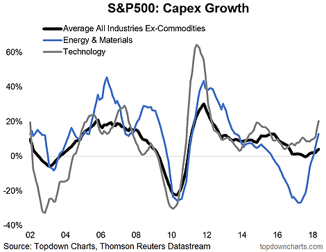
Here's a chart I find really interesting, it shows the annual pace of Capex growth across some of the key industries/sectors of the S&P500. The bottom line is that US business investment appears to be undergoing a revival. The upturn in US corporate capital expenditure growth stands in contrast to the more stagnant pace of government investment, but that could change later in the year as the Trump infrastructure spending proposals come back on the agenda after the mid-term elections. Could be premature to call it, but a public/private investment boom would make the macro backdrop look really interesting...
Q1 hedge fund letters, conference, scoops etc, Also read Lear Capital: Financial Products You Should Avoid?
Follow us on:
LinkedIn https://www.linkedin.com/company/topdown-charts
Twitter http://www.twitter.com/topdowncharts
Article by Callum Thomas, Top Down Charts


