
“Even if you are on the right track, you’ll get run over if you just sit there.” – Will Rogers
Q3 2019 hedge fund letters, conferences and more
I keep a dashboard of valuation indicators in my research folder, organized neatly by type. Right now, they are high. But how high and what does that mean? We’ll take a look at the latest readings and their implications today.
Let’s start with a quick review of the simple rules of supply and demand. You probably learned them in grade school, but that doesn’t make them any less powerful. Over the last several years, corporations have been the dominant buyer in the market, buying back their own shares. When corporations buy back their shares, there are fewer shares left for you and me to buy. With less supply out there, it takes fewer buyers to push the price higher. Of course, the reverse is also true.
This dynamic affects everything. For example, China is grappling with a swine fever epidemic. Due to loss of livestock, there is less available meat to buy. Some additional insight from NPR:
By the end of 2019, China’s production of pork could be cut in half. That’s roughly 300 million to 350 million pigs lost in China, which is almost a quarter of the world’s pork supply. It’s a massive number.
The growing Chinese pork shortage is good news, though, for pork producers in the rest of the world: China is now starting to import more pork, driving up prices.
With fewer pigs, China is importing less soy meal to feed them. That alone has been enough to push down global prices for soybeans, which means less money for farmers in Brazil and the U.S.
While this isn’t the sunniest current-day example, you can clearly see how price is affected based on the ongoing relationship between supply and demand—both on the upside and on the downside. These same dynamics play out in the stock and bond markets.
Since the late 1990s, the total number of listed companies on the New York Stock Exchange, NASDAQ and Amex has dropped from approximately 8,900 to 4,828 as of November 8, 2019. This is due to M&A activity, fewer companies wishing to go public, and—you guessed it—a record level of corporate share buyback campaigns over the last 10 years. There are simply fewer tradable shares available for you and me to buy.
The picture looks like this:
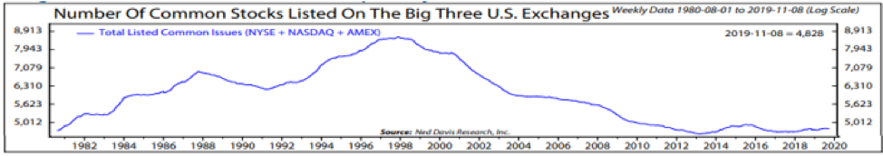
Source: Ned Davis Research
At the same time, as you can see in this next chart, households have a very large portion of their money invested in the stock market compared to their disposable personal income. They are “all in.” That means the buying has already taken place. Focus in on the orange line and note the % Gain/Annum in the data box at the bottom. Keep in the back of your mind prior market peaks (1966, 2000, and 2007)—and just look at the height of the line today.
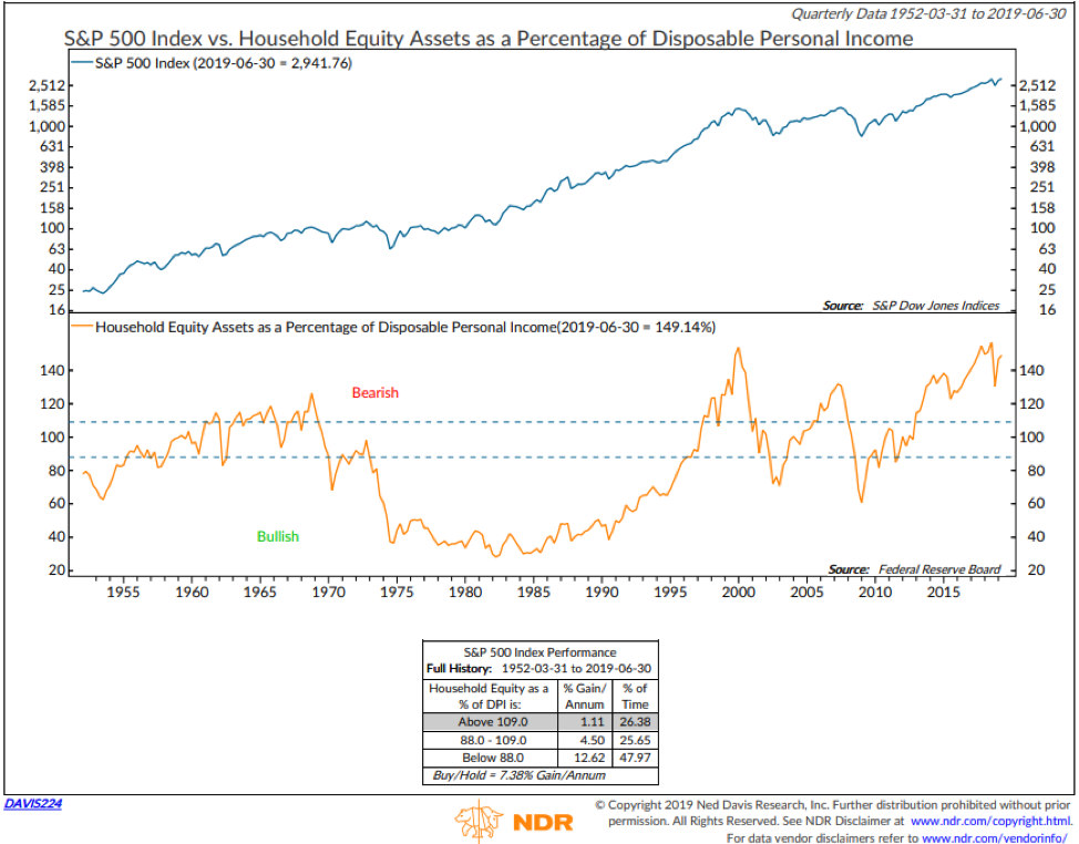
Source: Ned Davis Research
As we established, the other dominant buyer of stocks has been corporations. You’ve no doubt been hearing a lot about corporate share buybacks, an activity made easier with zero interest rate policy and QE. Can you imagine the desire corporations have had to borrow money to buy back their own shares? Certainly good news for the senior executives who have used the price gains to exercise those stock options. And imagine their ability to push price, making those stock option “in the money” trigger thresholds easier to reach. Fewer shares in circulation makes this a bit easier to do.
But “even if you are on the right track, you’ll get run over if you just sit there.” We move in cycles, and all cycles inevitably reach extremes. Then they correct, and opportunity arrives once again. What is the tipping point in any given cycle? No one knows for sure, but what is clear is that a lot of the buying that has driven prices higher is behind us.
My friend David Rosenberg shared this chart with me, and I with you, last May:

I believe we will one day look back and wonder what were we thinking. Seems it usually goes down that way. And on the way to all of that corporate debt is a prickly little fact: Half of investment grade companies are rated BBB (one notch above junk status).

“Prices determine how much money you make.” – Hermann Simon (the most influential management thinker after Peter Drucker)
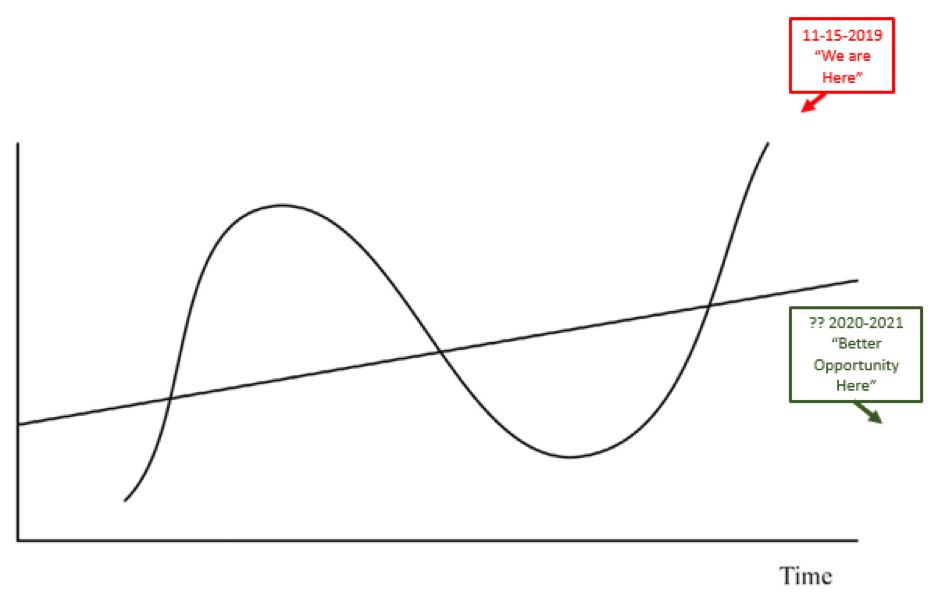
Due to supply and demand dynamics and human behavior, equity prices move above and below a predictable long-term growth trend line over time. I’m convinced a company’s trend growth of the stock is predictable over time, too (that’s the straight uptrend line pictured in the next chart); however, human behavior dynamics drive prices above and below that predictable trend growth as well. I again borrow the picture template for this from Howard Marks, but the notations are mine—red is bad, green is good:
More buyers than sellers—you get the picture. The result is higher share prices, and that’s good news until buying power wanes and the other side of the cycle takes hold. The challenge, of course, is on the flipside of this supply-and-demand relationship.
If you are the only one buying stock, your impact is small. If you are part of a large herd buying the same stock, your collective impact is large. This is where issues arise. If you are the only one in a movie theater, you can simply rise from your seat and rush through the door quickly on your way out. But if that movie is popular and the theater full, it’s not nearly as easy to exit. Add in an event, things can get dicey. With everyone crowded into cap-weighted index-based portfolios, mutual funds, and ETFs, it’s time to keep stop-loss triggers firmly in place. Buckle up—more defense than offense. There will be, at some point in the not too distant future, a “Better Opportunity Here.”
Go grab a coffee and click on the orange On My Radar button to continue reading. We’ll take a look at a few select valuation charts and what they tell us about coming returns. And you’ll find the latest link to Wednesday’s Trade Signals post. In your favorite chair? Read on…
If a friend forwarded this email to you and you’d like to be on the weekly list, you can sign up to receive my free On My Radar letter here.
Follow me on Twitter @SBlumenthalCMG
Included in this week’s On My Radar:
- Valuations – If You Hate Overpaying for Stuff, Don’t Do It
- Trade Signals – Extreme Optimism is a Concern, Don’t Fight the Tape or the Fed Moves to -1
- Personal Note – Moving Day
Valuations – If You Hate Overpaying for Stuff, Don’t Do It
Above, we looked at a simple chart that shows how markets cycle. Before we dive into a few of my favorite valuation metrics, the next chart reminds us that, over time, markets grow higher but they don’t always make us money. Zero in on the data box in the upper middle part of the chart. Data from 1901 to present, shows that “New Wealth” is created just 25.59% of the time. The Dow spent 33.64% of the time “Falling” (or in a Bear Market) and 40.77% of the time “Recovering From A Loss.”

Source: Ned Davis Research
That adds up to 74.41% of the time you’re pissed off at your broker… i.e., not making money. To me, this is where risk management comes into play and the importance in understanding how simple trend following can help you avoid the really big mistakes.
I do think there are a select few periods in time when risk management is most important and now is one of those times. See Trade Signals for a few ideas.
Valuations and What They Tell Us About Coming Returns
Chart 1: Median P/E
Here’s how to read the chart:
- The middle section tracks the month-end median P/E of the S&P 500 Index from 1964 to present (orange line).
- The 55.7-year median is a reading of 17.2. Call that “Fair Value.”
- In statistics, standard deviation is a number used to tell how far away something has moved from its long-term average. A low standard deviation means that most of the numbers are close to the average. You can see in the chart that there have been few periods since 1964 when the orange line was more than one standard deviation from the 55.7-year reading of 17.2.
- I like using median P/E because it is based on the actual trailing 12-months reported earnings and not the overhyped Wall Street estimated forward earnings.
Based on the actual earnings numbers, we can then see what expensive and undervalued look like.
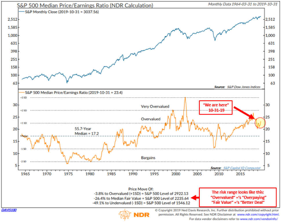
Source: Ned Davis Research
Now, one could argue that with interest rates so low, valuations should be higher, and I agree that makes sense. Therefore, I see a range between the overvalued level at 2,922.13 and the median fair value reading at 2,235. Perhaps both can be tilted a little higher but how much more? But not much, in my view.
I could walk you through a broad dashboard, price-to-sales, Shiller P/E, operating earnings, price-to-book, price-to-forward earnings, dividend yield, enterprise value, etc., but let’s pass on that this week. They are all flashing red. Instead, let’s look at Warren Buffett’s favorite indicator, stock market cap versus gross domestic income. Chart 2 compares the stock market (represented by the S&P 500 Index) to its long-term trend and what it foretells about coming returns.
Chart 2
Here’s how to read the chart:
- First, focus in on the red “We are Here” arrow (yellow circle). Looking at data back to 1925 and ranking that data into five quintiles (most undervalued to most overvalued) you can begin to get a sense of value. Simply, “If You Hate Overpaying for Stuff, Don’t Do It” when in the Top Quintile Overvalued zone.
- Lastly, the red arrow in the upper left-hand side points to the actual returns that occurred 1-, 3-, 5-, 7-, 9- and 11-years later. Negative for most years when in the Top Quintile (today’s reading) and best when in the Bottom Quintile.

Source: Ned Davis Research
I promise, double-promise and triple-promise that I will be shouting with megaphone in hand when we get to fair value and below fair value. Such periods present quickly, and this Buffett indicator will be quick to respond… since it is not dependent on waiting three months to get latest earnings numbers.
Ok… that’s it on valuations for another month or so. Hope you find this dialogue and supporting data analysis helpful.
With all of this said, the trend remains positive. The Trade Signals section is next with brief commentary then a click-through link to the full post.
Trade Signals – Extreme Optimism is a Concern, Don’t Fight the Tape or the Fed Moves to -1
November 13, 2019
S&P 500 Index — 3,092
Notable this week:
I thought I’d share a full version on Ned Davis Research’s Daily Trading Sentiment Composite. At the beginning of the year, trading sentiment had fallen to its lowest level (i.e., extreme pessimism) since 2006. Extreme pessimistic readings have historically been bullish for the market. Note the “% Gain/Annum” since 1994 (bottom left-hand side data box) and since 2006 (bottom right-hand side data box). Recall December 2018 and remember the extreme fear that was prevalent. The 20% correction in a few short months was the culprit.
Today, we are on the other side of the investor sentiment spectrum. Investor optimism, though not at record “Excessive Optimism,” is high having recently peaked above 70. Looking at the data boxes again, you can see we may have reached a short-term top. Note the red “We are Here” annotation. This suggests it is a good time to take some chips off the table and/or add to your hedges.
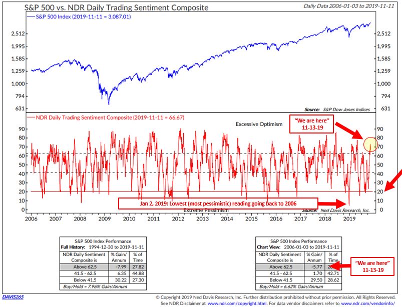
The “Don’t Fight the Tape and the Fed” indicator moved to a bearish -1. Factor that into your short-term risk calculations. The overall weight of trend evidence, however, remains bullish for equities, fixed income and gold. We’ll take a look at shareholder buybacks and some valuation indicators in the next On My Radar post. The equity market remains well above its long-term growth trend, late cycle and overvalued. Risk remains elevated.
Not a recommendation for you to buy or sell any security. For information purposes only. Please talk with your advisor about needs, goals, time horizon and risk tolerances.
Click here for this week’s Trade Signals.
Personal Note – Moving Day
Last Saturday was great fun. Despite a dominant performance by the Malvern Prep Friars, the game was determined by a final penalty kick, resulting in a 0-1 loss for the good guys. But the day started out well with a few Friars parents, an 11:30 a.m. mimosa, and pulled pork quesadillas at the Flying Pig—a fun little dive of a bar/restaurant in Malvern, Pennsylvania.
Hard to put into words how much joy I felt watching Susan honor Kieran and his teammates at the season-ending banquet. The evening was long, especially for the ninth graders seated at the table in the photo, but for the senior players who put in the thousands of hours of work and their parents—all of whom juggled schedules, club teams, homework, and late dinners—it was short. It all goes by all too fast. Though I have to say, I won’t miss the smell of those soccer cleats.
Sunday didn’t disappoint. I spent time with son Matthew golfing, which is always priceless. When he was young, he had a stuffed animal friend named Moo Cow. It went with him everywhere until Dad put it on top of his car while loading Matt into his car seat. No more Moo Cow. Sorry about that, Matt. Moo Cow’s memory lives on, however (see photo below).
Today is moving day. CMG has moved a few miles down the road from King of Prussia to Malvern. The new office is located about a mile from the Vanguard corporate campus in suburban Philadelphia. I really like the new space.
Son Kyle is home for the weekend. We are going to see the Broadway show Hamilton together on Saturday. Really looking forward to that time with him.
I hope this week’s letter finds you weathering the cold and finding some fun things to do.
Thanks for reading.
Warm regards,
Stephen B. Blumenthal
Executive Chairman & CIO

