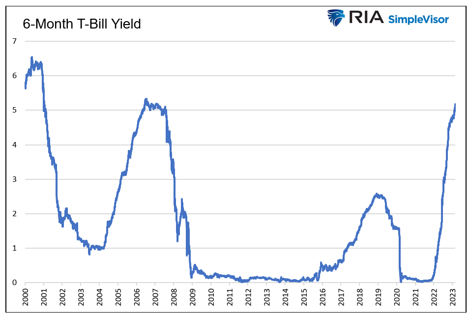
Imagine a world where someone can earn a 4%+ risk-free return. For the last 15 years, that image was a pipe dream. Today it’s reality. Consequently, investors face a risk-free rate not far from historical equity returns. This setup presents investors with options with which they are unfamiliar.
With the Fed purposely trying to slow economic growth and a banking crisis in full swing, do the heightened risks argue for accepting the current bond yields and reducing equity exposure?
Q1 2023 hedge fund letters, conferences and more
To help you appreciate the question, I will get wonky with statistics. This article visualizes risk and return profiles in different market environments and monetary policy stances. The goal is to better appreciate how changes in market tone and/or the Fed’s rate policy alter the expected risk and return profile of equities.

I will show how “fat tails” increase the odds of more risk and return than one might expect. I share distribution curves for bull versus bear markets, QE versus QT, and changes in the Fed funds rate.
Statistics 101 – Bell curves
Before we visualize risk and return profiles in different environments, it’s worth brushing up on statistics.
A normal data distribution has perfectly symmetrical returns. For example, if there are six days with a 2.456% gain over four years, there are also six with a 2.456% loss. A perfect bell curve distribution does not occur with stock returns and is a rarity in data sets. Regardless, the closer a collection of historical returns resembles a normal distribution, the more confidently we can quantify risk and return expectations.
Read the full article here by Michael Lebowitz, Advisor Perspectives.


