

 Hedge Fund News
News
Stay on top of the latest hedge fund news with Hedge Fund Alpha! The investment world is always in motion, so it’s never been more important for investors to stay informed on what hedge funds are doing. We bring you timely, accurate reporting on top hedge funds like ValueAct, Citadel, Greenlight Capital, Third Point, Pabrai Investment Funds and more. Dive into the diverse perspectives presented by Hedge Fund Alpha and go behind the headlines here. Hedge Fund Alpha is your go-to source of hedge fund news. From breaking news to developing stories, we have our fingers on the pulse of the hedge fund community and investment universe. Check out all the top headlines here with Hedge Fund Alpha.
Hedge Fund News
 Markets & Macro
Secondary Market Transactions In Pre‑IPO Companies: Opportunities And Investor Risks
 Markets & Macro
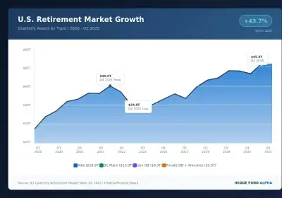
Policy Shifts And Private Assets: The Changing 401(K) Landscape
 Value Briefs
Investing Wisdom From The Oracle Of Omaha: Key Takeaways – LPL
 Hedge Fund News
2025 Hedge Fund Winners Confirmed As Systematic Funds Gain Early 2026 Traction
 Hedge Fund News
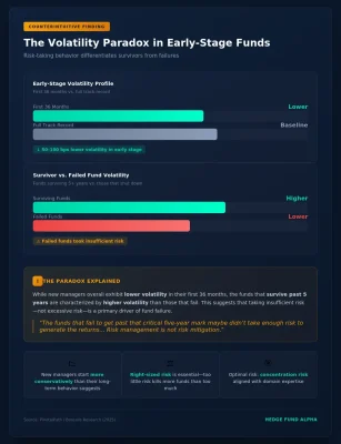
The Volatility Paradox: How New Hedge Fund Managers Can Turn Early Success into Long-Term Success [In-Depth Weekend Read]
 Markets & Macro
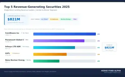
Global Securities Lending Revenue Hits $15B In 2025; These Were The Most Popular Stocks
 Press Releases
RPD Fund Management Caps Strong 2025: Fortress Delivers 34 of 35 Positive Months; Opportunity Fund Gains ~40%
 Hedge Fund News
2026 Hedge Fund Trends: Mega-Funds, AI, Quants, And Talent Wars To Dominate Headlines
Year-End Hedge Fund Scorecard: Equitile M3 Returns to the Forefront
 Hedge Fund NewsMarkets & Macro
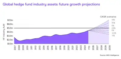
Low Vol, High Concentration, and $11 Trillion on the Sidelines: Goldman’s Fund Flow Review
Hedge Funds On Strongest Streak In A Decade Posting Eight Consecutive Months of Gains
 Hedge Fund News
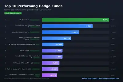
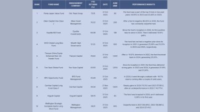
Top Performing Hedge Funds In 2025: Penta Japan Value In Lead Up 75% YTD, And High Flying Crypto Fund In Last
 Hedge Fund News
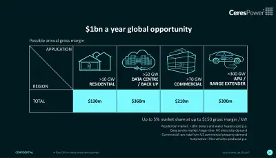
Grizzly Research: Ceres Power’s Revenue Is Tiny; Story Is Hype
 Press Releases
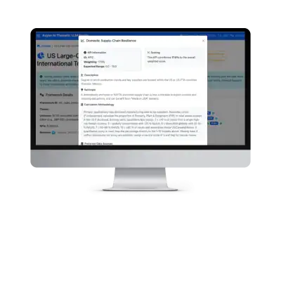
Axyon AI launches game-changing Agentic AI platform for thematic investing: Axyon Foresight
 Press Releases
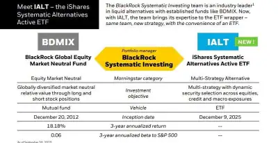
BlackRock Expands Liquid Alts with New Multi-Strategy Active ETF IALT
 Press Releases
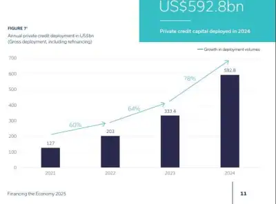
Strong growth sees private credit market reach $3.5 trillion
 Value Briefs
Berkshire Hathaway Announces Leadership Appointments; Todd Combs To Leave & Join JPMorgan
 Hedge Fund News
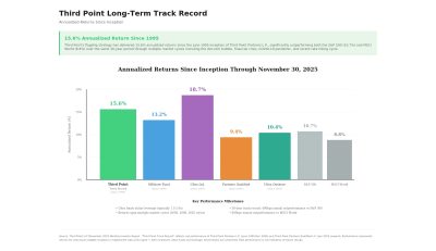
Third Point Dumps Primo Brands Amid “Overestimate”; Sells Out Of Meta & Apollo, Reduces Amazon Stake [Exclusive]
 Press Releases
