
If you follow me on Twitter you’ll be familiar with my weekly “Chart Storms”…
Q1 2021 hedge fund letters, conferences and more
Recently I started a (free) Substack account so that I could provide the same weekly selection of charts, as well as a little commentary — and allow those who are not on Twitter to join in the chart-fun!
I’ve included the latest edition (which you can find here) below, so that you can see what it’s all about — if it is of interest I encourage you to subscribe to the ChartStorm Substack.
n.b. I WILL NOT send you any more of these from this email list.
Hope you enjoy!
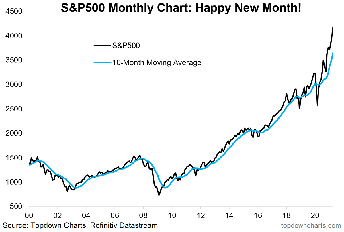
- 1. S&P500 Monthly Chart:
- 2. Short-term Bearish RSI Divergence:
- 3. Short-term Bearish Breadth Divergence:
- 4. Leveraged ETF Trading Activity:
- 5. AUM of leveraged-long equity ETFs at a new ATH:
- 6. Margin Debt Warning:
- 7. Margin Debt - ADJUSTED:
- 8. Earnings Sentiment:
- 9. S&P 500 Earnings:
- 10. Financials - Relative Value Indicator:
1. S&P500 Monthly Chart:
Happy New Month! Welcome to May. Here’s an update of the monthly chart – that vertical move got a few people talking… albeit the log chart is not as stark. Aside from that, it is still handily above the 10-month (~200day) moving average [a simple trend indicator].

Source: @topdowncharts
2. Short-term Bearish RSI Divergence:
Kind of speaks for itself – the textbook definition of a bearish divergence is a higher high in the index vs a lower high in the relevant indicator. It’s not necessarily a done deal, but I can think of a few prospective triggers for a short-term selloff/correction.
Source: @Callum_Thomas
3. Short-term Bearish Breadth Divergence:
Same as the previous chart, but this time looking at market breadth rather than price momentum. Some might argue that it’s natural to see price momentum taper off after a sharp move, but I find developments in breadth (basically weakness showing up in the underlying components) are typically less easy to explain away.
Source: @Callum_Thomas
4. Leveraged ETF Trading Activity:
This indicator has also moved into the risk zone (indicator tracks the ratio of volume traded in leveraged long vs short/inverse US equity ETFs). Couple things to note: a. the signal doesn’t always work, and b. sometimes it flags a big correction, other times a simple selloff.
Source: @topdowncharts
5. AUM of leveraged-long equity ETFs at a new ATH:
Just another sign of folk leveraging up in a FOMO frenzy to chase evermore gains.
Source: @topdowncharts
6. Margin Debt Warning:
Seems to be a theme here… some short-term risk flags, and a medium-term risk flag here. One more warning: n = 2. (also see the next chart, and also keep in mind the very low base comparator in March last year – arguably it’s a little overstated in that respect)
Source: @Not_Jim_Cramer
7. Margin Debt – ADJUSTED:
Here’s how it looks if you adjust margin debt for market cap (which you probably should do). As a proportion of market cap it’s high, but not really crazy by any means. We still see a clear acceleration – and in that respect it is consistent with the other anecdotal and data evidence that show excess optimism and greed pervading markets.
Source: @MrBlonde_macro
8. Earnings Sentiment:
Earnings call sentiment has surged after crashing last year – even gone on to a new All Time High.
Source: @daniburgz
9. S&P 500 Earnings:
EPS also hitting a new ATH. So there certainly is some fundamental reason to be optimistic (actual data is recovering, vaccine rollout, massive fiscal + monetary stimulus, pent up demand). I guess the issue is at this point it’s fairly obvious, while this time last year only a few were bold enough to suggest such an outcome.
Source: @charliebilello
10. Financials – Relative Value Indicator:
I’ve done a bunch of similar work that shows financials/banks very cheap on a relative basis (and it’s even more compelling at a global – especially global ex-US level). I usually find valuations speak for themselves at extremes, so this chart is very interesting to me.
Source: @KailashConcepts
Thanks for following, I appreciate your interest!
Thanks for reading, I appreciate your interest in my work.
Sincerely,
Callum Thomas
Head of Research at Topdown Charts

