
There are many different ways to show population density on a map.
One method, for example, would be to color regions based on people per unit of land. This could be done at the county, state, or national levels with varying results. Alternatively, you could show density more abstractly, such as in this compelling map of the Pearl River Delta in China.
Q3 hedge fund letters, conference, scoops etc
But one surprisingly insightful method for looking at population density is deceivingly simple: just put a dot on the map for every town with 1,000 people or more, and the results will give you a sense of where people live on a macro scale.
Replacing Towns With Dots
Using the dot methodology, it means New York City is the same size as Anytown, USA. This seems crazy, right?
Although this is surely a drawback, the results are still pretty interesting. After all, hubs like New York City are centers of commerce and culture, and they are surrounded by hundreds of other nearby towns.
Let’s take a look at (most of) North America:
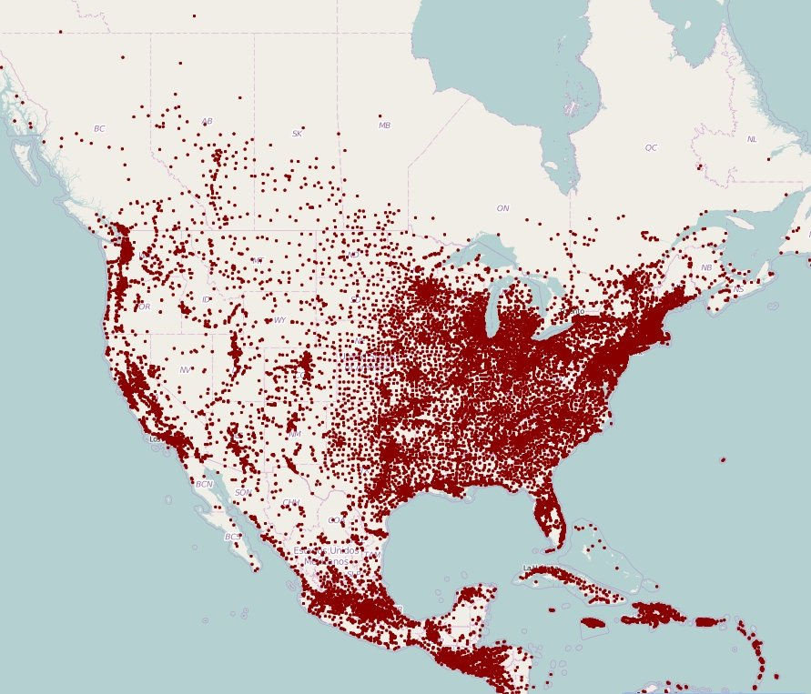
A few things that are noticeable right away?
You can see the difference in topography between the plains and the more mountainous part of the continent. In flatter places like Nebraska or Saskatchewan, the towns are evenly spread out – and in regions with uneven geography, such as Colorado or British Columbia, towns are typically located in the valleys.
Further, the density in the Northeastern part of the United States and surrounding the Great Lakes work to provide quite a contrast to the emptier parts of the continent.
Natural features like the Everglades are also quite easy to spot on the map – it’s one of the only non-populated areas in an otherwise dense Florida. If you look at the northwestern tip of Wyoming, you’ll also see a lack of dots in the 2 million acres of Yellowstone National Park.
Europe and MENA
Now let’s go across the Atlantic – here’s a map of Europe, North Africa, and most of the Middle East.
(Click to open a larger version)
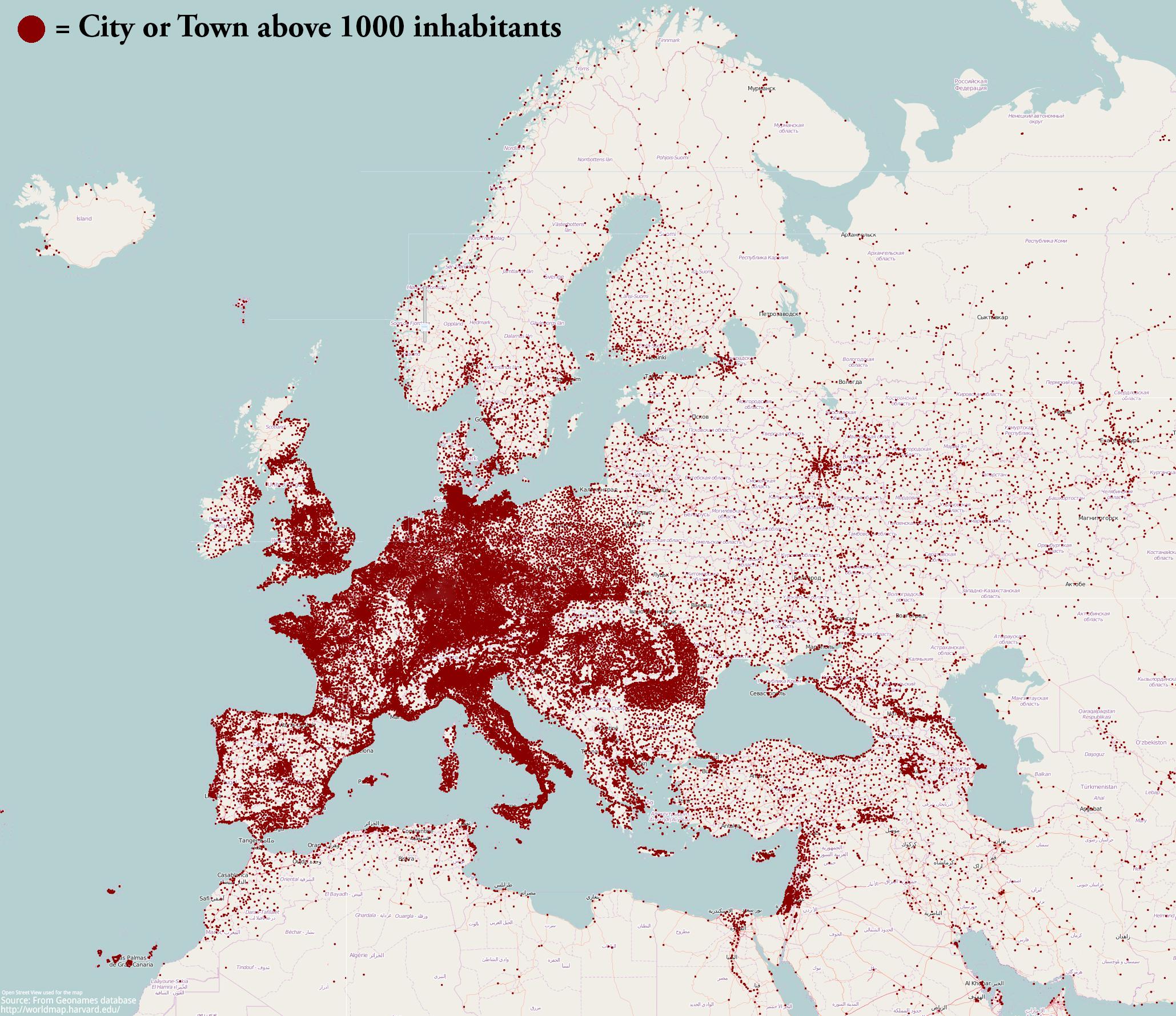
This map is also pretty spectacular – you can see the cities along the Nile, the “eye” of Moscow, and impressive amounts of population density in places like Belgium, Holland, Germany and Switzerland.
World View
While we haven’t seen a world map using this method, it’s not hard to imagine what places like India, China, Japan, or Bangladesh could look like with dots replacing each town within their borders.
These are the densest parts of the world – to even more extreme levels than the denser parts of Europe shown above.
Here’s a more standard population density map, using people per square kilometer, to give you an idea:
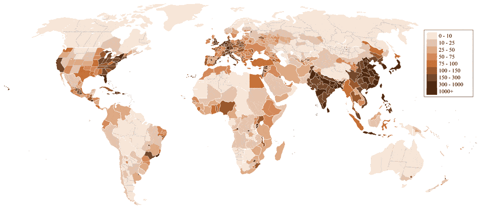
If you’re looking for more perspective on global population density, this unique map is worth a look. It shows how dense the aforementioned Asian region above is in a very compelling and simple way.
Article by Visual Capitalist

