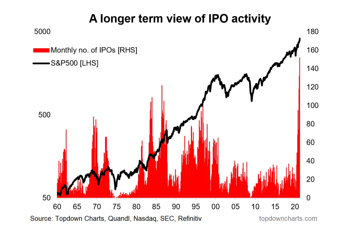
- The pace of US IPO activity has shattered previous records.
- It is a clear sign of excess and market froth.
- The stampede into IPOs reflects (past) performance.
- Increasing issuance of IPO/SPAC/ETFs, in many respects is a natural supply response to the new age of retail investing.
Q1 2021 hedge fund letters, conferences and more
One of the most stark (and most commented on) charts from the latest S&P500 ChartStorm showed total US equity issuance on track to shatter the record books.
I commented that it made logical sense: it’s basically the perfect environment to raise equity capital …valuations are near record highs, the system is awash with liquidity, and there are clear signs of excess optimism.
The cost of capital is low, and the availability is high.
As a follow-up post, I thought I would collate together a couple of particularly interesting charts on the state of the US IPO market (and any implications for the outlook for US equities).
- A New Boom: History is no stranger to IPO booms, we’ve seen periods of excess in the past – even extended periods (e.g. the late-60’s, the 80’s – at least up until 87, and of course the 90’s). The current period is interesting for two reasons: a. it smashes all previous records for the pace of activity; but b. it follows an extended period of relative quietude in the IPO markets. It leaves us an open question as to whether this is a flash in the pan or the beginning of a new boom time like the 80’s…

- What’s the Signal? I used to maintain this chart because it appeared to have some signal for market timing e.g. periods of heightened IPO activity tended to occur close to market peaks …while troughs in activity (and spikes in withdrawals) tended to occur close to/at market bottoms. So I guess the takeaway is that we could be close to a market top, but then you could have said the same early last year based on this indicator. Keep dancing while the music plays?

- SPACtacular: The rise and rise of SPACs has clearly been a key driver of the surge in overall IPO activity. Some might argue that it overstates the overall number of IPOs, but I would say it does *not* overstate the state of speculation.

- IPO Performance: People are not dumb (albeit you do wonder sometimes), most often in markets money flows to the best performing asset… the best historically performing asset.
Chasing performance is a well documented behavior, and so it helps put things into context when you see how the Renaissance IPO ETF has performed (the ETF tracks the performance of recently IPO’d stocks). Basically it more than 2x’d the performance of the S&P500.

- Investment Funds miss the Fun: I thought it could be interesting to see whether the IPO trends were at all mirrored in the investment fund space, but nothing could be further from the truth. While ETF launches have picked up in the last few months, it’s much for muchness vs recent history. But on the mutual fund side there has been a significant wave of shuttering funds.
It echoes what we saw in 2009, and likely reflects a combination of outflows, performance issues, and probably of most relevance: companies taking the opportunity/excuse to cut costs by closing subscale funds. Another new dynamic though is the retail revolution – folk are plenty happy to just DIY as trading costs fall further and ease of entry to new traders is like nothing before seen in history. So we probably do see more tradable funds/instruments like ETFs and of course more products (IPOs) to meet this rising demand.

Final Thoughts: We’re clearly in an extraordinary environment. The new boom in the IPO market certainly reflects this (as do other metrics such as valuations). But for now, the liquidity still flows – central banks are still for the most part in aggressive easing mode, and greed still overwhelmingly exceeds fear.
It’s a challenging part of the market cycle: it’s uncomfortable to stay in the market given these signs of excess, but it can be equally uncomfortable to sit on the sidelines. I’m watching a few key metrics such as the equity risk premium, the macro data pulse, and of course policy and liquidity. Things are on the move, but in many respects the music is still playing…
NOTE: this post first appeared on my new Chart Storm Substack: https://chartstorm.substack.com/
Best regards,
Callum Thomas
Head of Research and Founder of Topdown Charts
Follow us on:
LinkedIn https://www.linkedin.com/company/topdown-charts
Twitter http://www.twitter.com/topdowncharts
Article by Top Down Charts

